ui-hint 参考
基础用法
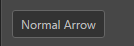
<ui-hint>Normal</ui-hint>
属性
| 属性名 |
参数值类型 |
功能说明 |
position |
percentage/pixel values,百分值或像素值 |
控制箭头距离上/左的偏移量,支持负值 |
样式控制
| 种类 |
参数值类型 |
功能说明 |
| direction |
class 样式名,string,支持值"top, bottom, left, right" |
控制箭头指向,未指定时不显示箭头 |
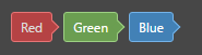
| color |
class 样式名,string,支持值"red, blue, green" |
控制组件颜色 |
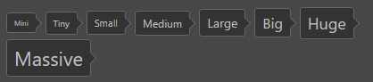
| size |
class 样式名,string,支持值"mini, tiny, samll, medium, large, big, huge, massive" |
控制组件整体大小 |
| shadow |
class 样式名,string,支持值"shadow" |
带阴影版组件 |
使用效果示例
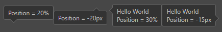
position 控制箭头偏移量
<div class="group">
    <ui-hint class="bottom" position="50%">Position = 20%</ui-hint>
    <ui-hint class="top" position="-20px">Position = -20px</ui-hint>
    <ui-hint class="left" position="30%">Hello World <br> Position = 30%</ui-hint>
    <ui-hint class="right" position="-15px">Hello World <br> Position = -15px</ui-hint>
</div>
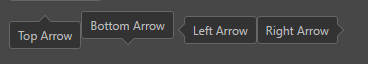
direction 控制箭头方向
<div class="group">
    <ui-hint class="top">Top Arrow</ui-hint>
    <ui-hint class="bottom">Bottom Arrow</ui-hint>
    <ui-hint class="left">Left Arrow</ui-hint>
    <ui-hint class="right">Right Arrow</ui-hint>
</div>
color 控制组件颜色
<ui-hint class="red">Red</ui-hint>
<ui-hint class="green">Green</ui-hint>
<ui-hint class="blue">Blue</ui-hint>
size 控制大小
<ui-hint class="mini">Mini</ui-hint>
<ui-hint class="tiny">Tny</ui-hint>
 ····
shadow
<ui-hint class="shadow">Hello World</ui-hint>

搭配其他元素的混合效果