EditBox component reference
EditBox is a text input component, you could use this component to gather user input easily.

Click Add component button at the bottom of Properties panel and then select EditBox from add UI component, then you add the EditBox component to the node.
For EditBox API reference, please refer to EditBox API.
Layout property
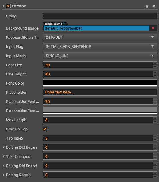
| Property | Function Explanation |
|---|---|
| String | The initial input text of EditBox. |
| Background Image | The background image of EditBox. |
| Keyboard Return Type | The keyboard return type of EditBox. This is useful for keyboard of mobile device. |
| Input Flag | Specify the input flag: password or capitalize word. (Only supports Android platform) |
| Input Mode | Specify the input mode: multiline or single line. |
| Font Size | The font size of input label. |
| StayOnTop | The input is always visible and be on top of the game view. |
| TabIndex | Set the tabIndex of the DOM input element, only useful on Web. |
| Line Height | The line height of input label. |
| Font Color | The font color of input label. |
| Placeholder | The content string of placeholder. |
| Placeholder Font Size | The font size of placeholder label. |
| Placeholder Font Color | The font color of placeholder label. |
| Max Length | The maximize input characters. |
EditBox Event

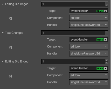
Editing Did Began Event
| Property | Function Explanation |
|---|---|
| Target | Node with the script component. |
| Component | Script component name. |
| Handler | Assign a callback function which will be triggered before user starting to input text. |
Text Changed Event
| Property | Function Explanation |
|---|---|
| Target | Node with the script component. |
| Component | Script component name. |
| Handler | Assign a callback function which will be triggered when user is editing text. |
Editing Did Ended Event
| Property | Function Explanation |
|---|---|
| Target | Node with the script component. |
| Component | Script component name. |
| Handler | Assign a callback function which will be triggered after user finished input text. Usually when in single line input mode, it's triggered after user press return key or click the area outside of EditBox. When in multiline input mode, it's triggered only after user click the area outside of EditBox. |
Detailed explanation
- Keyboard Return Type is mainly designed for mobile device input. You could use this option to customize return key style of virtual keyboard.
- If you want to input password, you need set
Input FlagtoPASSWORDand theInputModemustn't beANY, usually we useSingleLine. - If you want to enable multiline input support, the flag of
InputModeshould be set toAny. - The background image of EditBox support slice 9, you could customize the border as you did in Sprite component.
Note: When used in a iframe, you should set stayOnTop property to true.