Layout component reference
Layout is a container component. The container can unlock the auto-layout function to automatically arrange all the sub-objects according to the specifications so that the user can use it to make list, page turning and other functions conveniently.
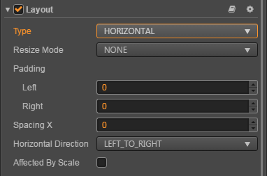
Horizontal Layout

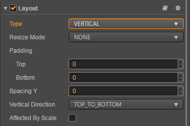
Vertical Layout

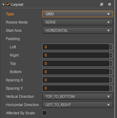
Grid Layout

Click the Add Component button at the bottom of Properties panel and then select Layout from the UI Component to add the Layout component to the node.
Layout properties
| Property | Function Explanation |
|---|---|
| Type | Layout type, currently has NONE, HORIZONTAL, VERTICAL and Grid. |
| Resize Mode | Resize strategies, currently has NONE, CHILDREN and CONTAINER. |
| Padding Left | The left padding between the sub-object and the container frame in the layout. |
| Padding Right | The right padding between the sub-object and the container frame in the layout. |
| Padding Top | The top padding between the sub-object and the container frame in the layout. |
| Padding Bottom | The bottom padding between the sub-object and the container frame in the layout. |
| Spacing X | The separation distance between sub-objects in the horizontal layout. NONE mode doesn't have this attribute. |
| Spacing Y | The separation distance between sub-objects in the vertical layout. NONE mode doesn't have this attribute. |
| Horizontal Direction | When it is designated as horizontal layout, which side does the first child node start in the layout? The left or the right? |
| Vertical Direction | When it is designated as vertical layout, which side does the first child node start in the layout? The upside or the downside? |
| Cell Size | This option is only available in Grid layout, Children resize mode. The size of each child element. |
| Start Axis | This option is only available in Grid layout, the arrangement direction of children elements. |
| Affected By Scale | Whether the scaling of the child node affects the layout. |
Detailed explanation
The default layout type is NONE after adding the Layout component. It indicates that the container won't change size and location of the sub-object. When the user places sub-object manually, the container will take the minimum rectangular region that can contain all the sub-objects as its own size.
You can switch the layout container type by altering Type in Properties panel, all the layout types support Resize Mode.
When Resize Mode is NONE, the container and sub-objects' size is independent of each other.
When Resize Mode is CHILDREN, the sub-objects' size will change with container's size.
When Resize Mode is CONTAINER, the container's size will change with sub-objects' size.
When using Grid layout, the Start Axis is very important. When choosing HORIZONTAL, it will fill an entire row before a new row is started. When choosing VERTICAL, it will fill an entire column before a new column is started.
Nodes:
- Scaling and rotation of child nodes are not considered.
- After setting the Layout, the results need to be updated until the next frame, unless you manually call
updateLayoutAPI.