
- 中文
- Cocos Creator
- Cocos2d-x
- AnySDK
-
Cocos Creator 2.0Version: 2.0
Sprite Component Reference
Using Sprite is the most common way to display images in 2D games. By adding a Sprite component to a Node, you can display the images in the project's resources in the Scene.
You can add a Sprite component to the node by clicking the Add Component button below the Properties and selecting Sprite from the Add Renderer Component menu.
Please refer to Sprite API for the script interface.
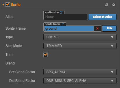
Sprite Properties
| Properties | Description |
|---|---|
| Atlas | Auto Atlas which the Sprite display image resource belongs to. ( Select In Atlas button after Atlas, this feature is temporarily unavailable and we will optimize it as soon as possible) |
| Sprite Frame | SpriteFrame image resource which is used to render the Sprite. (The Edit button behind Sprite Frame is used to edit the nine rectangle grid cutting of the image resource, please refer to Use a Sliced Sprite to make a UI image for details) |
| Type | Rendering mode, currently includes Simple, Sliced, Tiled, Filled and Mesh five rendering modes. |
| Size Mode | Specify the size of the SpriteTrimmed automatically fit to the size of the sprite croppedRaw automatic fit for sprite original sizeCustom use the node preset size. When the user manually modifies Size properties, Size Mode will be automatically set to Custom. |
| Trim | Whether the transparent pixel area is included in the node bounding box, which takes effect only when the Type is set to Simple. Please refer to Auto Trim for SpriteFrame. |
| Src Blend Factor | The source image blend mode. |
| Dst Blend Factor | the destination image blend mode. Together with the above properties, you can mix the foreground and background Sprite in different ways to render, and the effect preview can refer to glBlendFunc Tool. |
After adding the Sprite component, drag the Texture or SpriteFrame type resource from the Assets to the Sprite Frame attribute reference. Then, the resource image can be displayed through the Sprite component.
If this SpriteFrame resource is contained within an Atlas resource, then the Atlas attribute of the Sprite will be set up along with it.
To dynamically replace spriteframe, you need to dynamically load the picture resource before you replace it, please refer to Acquire and load asset: how to dynamically load.
Rendering mode
Currently, the Sprite component supports five rendering modes:
Simple mode: rendering the Sprite according to the original image resource. It is normally used along withUse Original Sizeto guarantee the image shown in the scene is in full accordance with the image designed by the graphic designer.Sliced mode: the image is cut up into a nine square grid and according to certain rules is scaled to fit freely set dimensions (size). It is usually used in UI elements or to make images that can be enlarged infinitely without influencing the image quality into images cut up into a grid to save game resource space. Please read use Sprite editor to make a Sudoku image for detailed information.Tiled mode: as the size of the Sprite increases, the image is not stretched, but it Will repeat according to the size of the original picture, paving the original picture to the size of the entire Sprite as tiled tiles.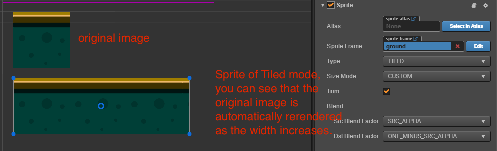
Filled mode: draws a portion of the original picture in a certain direction and scale, based on the origin and fill mode settings. Often used for dynamic display of progress bars.Mesh mode: Only support .plist file which is built by TexturePacker (4.0 or higher version) with ploygon algorithm.
Filled mode
When the Type property selects Filled mode, a new set of properties appears to be configured. So let's explain their roles in turn.
| Attribute | Function Explanation |
|---|---|
| Fill Type | Fill type selection, including HORIZONTAL, VERTICAL, and RADIAL. |
| Fill Start | Normalized values for filling starting position (from 0 ~ 1, denoting the percentage of total population), when you select a horizontal fill, the Fill Start is set to 0, and it is populated from the leftmost edge of the image. |
| Fill Range | Normalized values for padding ranges (same from 0 ~ 1). When set to 1, it fills up the entire range of the original image. |
| Fill Center | Fill Center Point, this property appears only if the Radial type is selected. Determines which point on the Sprite is used as pivot when the FillType is set to RADIAL, the coordinate system used are the same as the Anchor. |
Fill Range Supplemental description
Under both the horizontal and VERTICAL fill types, the values set by Fill Start affect the total number of fills, if Fill Start is set to 0.5, even if Fill Range is set to 1.0, the actual padding is still only half the total size of the Sprite.
Fill Start in the RADIAL type only determines the orientation of the starting fill, when Fill Start is set to 0, start filling from the x axis positive direction.
Fill Range determines the total amount of padding, which fills the entire circle when Fill Range is set to 1. A counter anticlockwise fill when Fill Range is positive, and is filled clockwise when negative.