
- 中文
- Cocos Creator
- Cocos2d-x
- AnySDK
-
Cocos Creator 2.0Version: 2.0
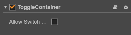
ToggleContainer component reference
ToggleContainer is not a visiable UI component but a way to modify the behavior of a set of Toggles. Toggles that belong to the same group could only have one of them to be switched on at a time.
Note: All the first layer child node containing the toggle component will auto be added to the container
Click the Add component button at the bottom of the Properties panel and select ToggleContainer from Add UI component. You can then add the ToggleContainer component to the node.
The API reference of ToggleContainer is here: ToggleContainer API.
ToggleContainer property
| Property | Functions Explanation |
|---|---|
| allowSwitchOff | If this setting is true, a toggle could be switched off and on when pressed. If it is false, it will make sure there is always only one toggle could be switched on and the already switched on toggle can't be switched off. |
Detailed explanation
The ToggleContainer won't be used alone and it usually be used with Toggle to implement the RatioButton.