Toggle Component Reference
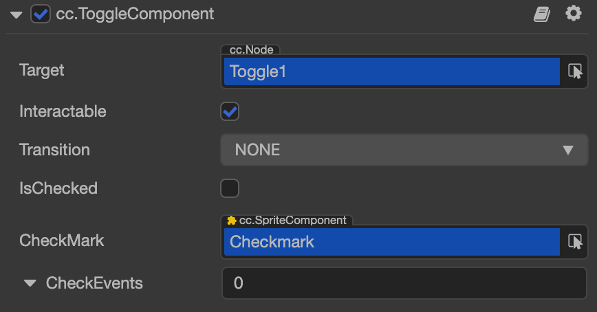
The Toggle component is a CheckBox, when it's used together with a ToggleGroup, it could be treated as a RadioButton.

Click the Add Component button at the bottom of the Inspector panel and select UI/Toggle to add the Toggle component to the node.
To use Toggle, please refer to the Toggle API documentation and the toggle scene of the test-cases-3d project.
Toggle Properties
| Properties | Function Explanation |
|---|---|
| IsChecked | Boolean type. When set to true, enable the check mark component |
| CheckMark | Sprite type. The image displayed when Toggle is selected |
| CheckEvents | List type, default is null. Each event added by the user is composed of the node reference, component name and a response function. Please see the Toggle Event section below for details |
Note: because Toggle is inherited from Button, so the properties exists in Button also apply to Toggle, please refer to the Button Component for details.
Toggle Event
For event structure you can refer to the Button documentation.
The Toggle event callback has two parameters, the first one is the Toggle itself and the second is the customEventData.
Detailed Explanation
The generic node hierarchy of Toggle is as below:

Note: the checkMark node needs to be placed on the upper level of the background node in the Scene.
Add a callback through the script code
Method one
The event callback added by this method is the same as the event callback added by the editor, all added by code. First you need to construct a EventHandler object, and then set the corresponding target, component, handler and customEventData parameters.
import { _decorator, Component, Event, Node, ToggleComponent, EventHandler } from "cc";
const { ccclass, property } = _decorator;

@ccclass("example")
export class example extends Component {
    onLoad(){
        const checkEventHandler = new EventHandler();
        // This Node is the node to which your event processing code component belongs
        checkEventHandler.target = this.node;
        // This is the script class name
        checkEventHandler.component = 'example';
        checkEventHandler.handler = 'callback';
        checkEventHandler.customEventData = 'foobar';

        const toggle = this.node.getComponent(ToggleComponent);
        toggle.checkEvents.push(checkEventHandler);
    }

    callback(event: Event, customEventData: string){
        // The event here is a Touch Event object, and you can get the send node of the event by event.target
        // The customEventData parameter here is equal to the "foobar" you set before
    }
}
Method two
Added by the way of toggle.node.on('toggle', ...).
// // Suppose we add an event handler callback inside a component's onLoad method and event handlers in the callback function:

import { _decorator, Component, ToggleComponent } from "cc";
const { ccclass, property } = _decorator;

@ccclass("example")
export class example extends Component {
    @property(ToggleComponent)
    toggle: ToggleComponent | null = null;
    onLoad(){
       this.toggle.node.on('toggle', this.callback, this);
    }

    callback(toggle: ToggleComponnet){
        // The callback parameter is the Toggle component, note that events registered this way cannot pass customEventData.
    }
}