Widget Component Reference
Widget is a frequently used UI layout component. It can automatically align the current node to any position in the parent node's bounding box, or constrain the size, to make your game easily adaptable to different resolutions. About the alignment scheme, please see Widget Alignment for details.
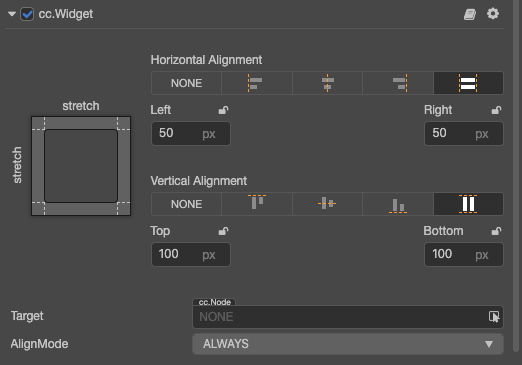
Click the Add Component button at the bottom of the Inspector panel and select UI/Widget to add the Widget component to the node.
To use Widget, please refer to the Widget API documentation and the widget scene of the test-cases-3d project.
Widget Properties
| Properties | Function Explanation | Note | |
|---|---|---|---|
| Top | Upper border alignment | Once selected, an input field will appear to set the distance between the upper border of the current node and the upper border of the parent object. | |
| Bottom | Lower border alignment | Once selected, an input field will appear to set the distance between the lower border of the current node and the lower border of the parent object. | |
| Left | Left border alignment | Once selected, an input field will appear to set the distance between the left border of the current node and the left border of the parent object. | |
| Right | Right border alignment | Once selected, an input field will appear to set the distance between the right border of the current node and the right border of the parent object. | |
| HorizontalCenter | Horizontal center alignment | ||
| VerticalCenter | Vertical center alignment | ||
| Target | Alignment target | Specifies an alignment target that can only be one of the parent nodes of the current node. The default value is null, and when null, indicates the current parent. If the parent node is the entire scene, it will be aligned to the visible area of the screen ( visibleRect), and can be used to dock UI elements to the edge of the screen. |
|
| Align Mode | Specifies the alignment mode of the Widget, which determines when the widget should refresh at runtime | Normally set to ALWAYS, only to be initialized and realigned whenever the window size changes. Set to ONCE, will only make alignment when the component is enabled. Set to ON_WINDOW_RESIZE, will update Widget's alignment every time when the window changes. |
Border alignment
We can create a new Sprite node under the Canvas node, add a Widget component to the Sprite, and do the following test:
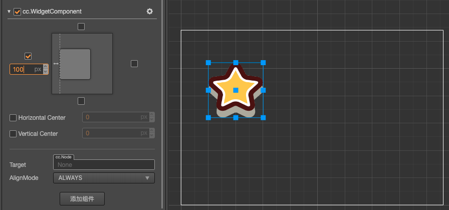
Left alignment, left border distance 100 px:
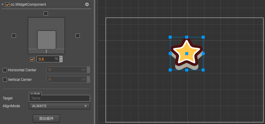
Bottom alignment, bottom border distance 50%:
The percentage will take the width or height of the parent node as a benchmark.
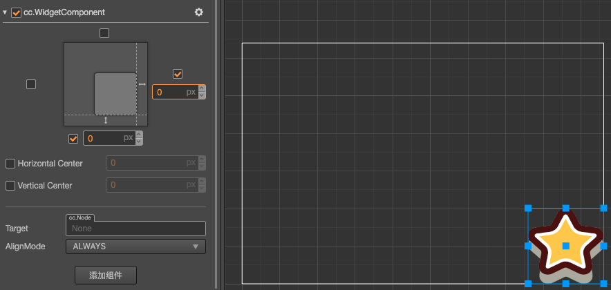
Bottom right alignment, border distance 0 px:
Center Alignment
Horizontal center alignment:
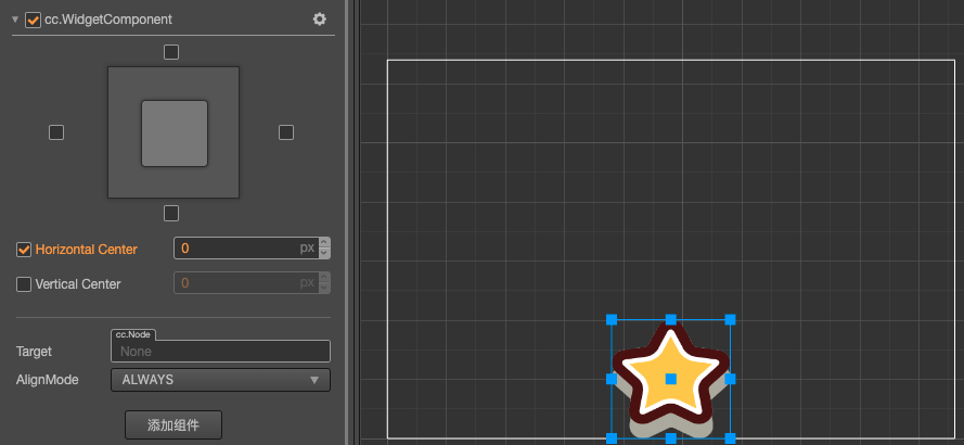
Vertical center alignment and right border distance 50%:
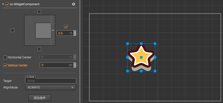
Limit size
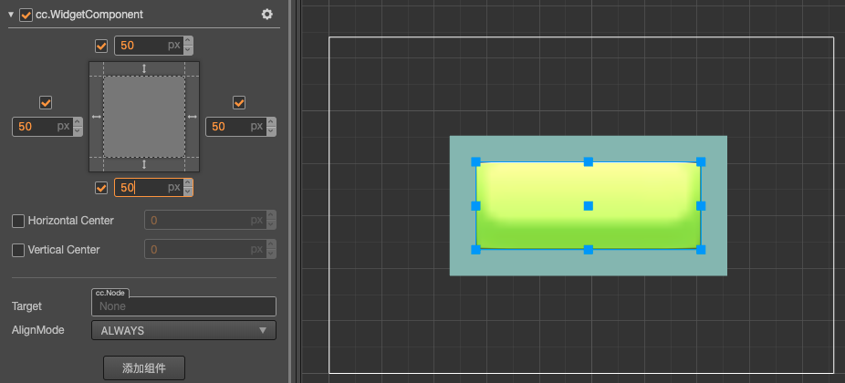
If you align the left and right side at the same time, or align the top and bottom at the same time, then the size will be stretched in the corresponding direction.
Let us look at a demonstration. Place two rectangular Sprites in the Scene and take the bigger one as the dialog box background and the smaller one as the button on the dialog box. Take the button node as the child node of the dialog box and set the button into SLICED mode so that you can observe the stretch effect.
Horizontal stretch, left and right margin 10%:
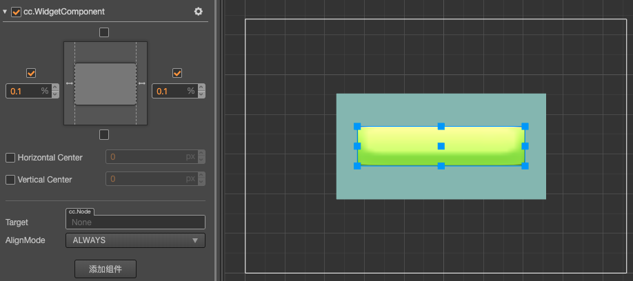
Vertical stretch, no margins on each end and horizontal center alignment:
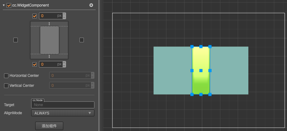
Stretch in the horizontal and vertical directions, margin 50 px:
Limitation on node position control
If Align Mode property is set to ALWAYS, the Widget will set the alignment for the current node every frame at runtime according to the alignment policy you set. The position and size (width, height) properties of the node where the component is located may be restricted and cannot be freely modified via the API or animation system.
This is because the alignment set by the widget is processed at the end of each frame, so if you set the previously set alignment related properties in the Widget component, those settings will eventually be reset by the widget component's own settings.
To make sure you can update node's position or size during runtime:
- Set Align Mode property of Widget to
ONCE, so it will only align during onEnable process. - Use Widget's API to update node's position and size, for example updating Widget's
top,bottom,left,rightinstead of node'sx,y,width,height.
Modify the alignment distance in script code. Example:
import { _decorator, Component, Widget } from 'cc';
const { ccclass, property } = _decorator;

@ccclass('Example')
export class Example extends Component {
    start () {
        const widget = this.getComponent(Widget);
        // Set the default alignment unit to px
        widget!.bottom = 50;
        widget!.top = 50;

        // The alignment unit is%
        widget!.isAbsoluteTop = false;
        widget!.isAbsoluteBottom = false;
        widget!.bottom = 0.1; // 10%
        widget!.top = 0.1; // 10%
    }
}