Auto Layout Container
The Layout component can be mounted to any Node, making the node into a container with the auto layout function. The so-called auto layout container can automatically array the child nodes according to certain rules and adjust the container type nodes of its own size according to the sum total of bounding boxes of the node content.
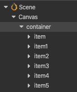
For the next layout types, the node structure is as follows:

Layout Type
Auto layout components have several basic layout types. These can be set up by the Layout Type property, which includes the following types.
Horizontal Layout

When Layout Type is set to Horizontal, all child nodes will be automatically aligned horizontally and the component will modify the position or height of the node on the y-axis by default. If the child node needs to be placed outside the height range of the Layout node's bounding box, you can uncheck AutoAlignment (as shown above).
The situation that the content exceeds the container easily under horizontal sorting, the following measures can be taken as needed.
If the container is to adapt to the size of the content, you can set the
ResizeModetoContainer, which will set the width of the Layout node based on the sum of the widths of the child nodes (Width) (left in the figure below).If the content object is always to remain inside the container, you can set
ResizeModetoChildren, which will limit the size of the content object to the container (right in the figure below).If you want the child nodes to be aligned upwards on the y-axis, you can add a widget component to the child node and turn on the
ToporBottomalignment mode.

Horizontal Direction
In the horizontal layout, you can set the horizontal orientation with HorizontalDirection. There are two types of orientation: LEFT_TO_RIGHT and RIGHT_TO_LEFT. The former will arrange the nodes from left to right according to their display order in Hierarchy. The latter will arrange the nodes from right to left according to their display order.
Vertical Layout
The layout and orientation of vertical layout is almost the same as horizontal layout, only the orientation is different.
Grid Layout
Layout Type set to Grid will start the grid layout. The grid layout will determine the starting point of the layout based on the combination of HorizontalDirection and VerticalDirection within a fixed container size, and the layout direction based on the StartAxis property.
Grid Direction
Layout arranges the child nodes in the order in which they are displayed in the Hierarchy, plus the start point and the alignment direction set by the StartAxis property.
- Start axis
- Set to either
HORIZONTALorVERTICALorientation. The former will be aligned horizontally, the latter vertically.
- Set to either
- Start point
- The start point is created by combining
HorizontalDirectionandVerticalDirection. - Suppose
HorizontalDirectionisLEFT_TO_RIGHTand VerticalDirection isTOP_TO_BOTTOM, then the start point is top left. - Suppose
HorizontalDirectionisRIGHT_TO_LEFTand VerticalDirection isBOTTOM_TO_TOP, then the start point is bottom right.
- The start point is created by combining
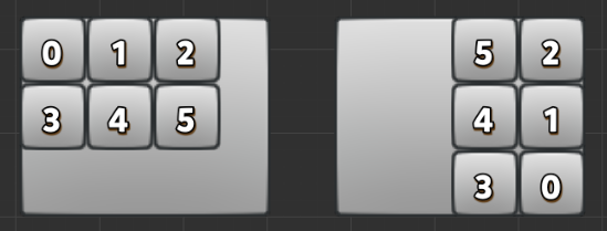
Two examples are given in conjunction with alignment directions:
If the
HorizontalDirectionis set toLEFT_TO_RIGHT,VerticalDirectionisTOP_TO_BOTTOMandStartAxisisHORIZONTAL. This tells the component to be sorted horizontally starting from the top left of the container (below left).If the currently set
HorizontalDirectionisRIGHT_TO_LEFT, VerticalDirection isBOTTOM_TO_TOPandStartAxisisVERTICAL, it is telling the component to be sorted vertically starting from the BOTTOM RIGHT of the container (right in the figure below).
Grid sorting may also cause the content to exceed the container, which can also be solved by using the Children and Container modes of ResizeMode mentioned in Horizontal Layout.
For more information, please refer to the Layout component documentation.