EditBox component reference
EditBox is a text input component, you could use this component to gather user input easily.

Click Add Component button at the bottom of Properties panel and then select EditBox from UI Component, then you can add the EditBox component to the node.
For EditBox API reference, please refer to EditBox API.
Upgrade for EditBox component
In v2.1.1, we've made some adjustment and optimization on EditBox component. The change mainly includes:
- Add
textLabel,placeholderLabel,backgroundproperties, users can configure the style of EditBox component more flexibly by attaching a custom Label or Sprite component. - Deprecated
fontSize,fontColor,lineHeight,placeholderFontSize,placeholderFontColor,backgroundImage,stayOnTopproperties, Cocos Creator will automatically upgrade these properties to the corresponding properties on the attached components. - Deprecated the
setFocus()method, add new methodsfocus()andblur(), which provides users with the ability to force ending editing editBox.
Layout properties
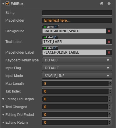
| Property | Function Explanation |
|---|---|
| String | The initial input text of EditBox. |
| Placeholder | The content string of placeholder. |
| Background | The Sprite component attached to the node for EditBox's background. |
| Text Label | The Label component attached to the node for EditBox's input text label. |
| Placeholder Label | The Label component attached to the node for EditBox's placeholder text label. |
| KeyboardReturnType | The keyboard return type of EditBox. This is useful for keyboard of mobile device. |
| Input Flag | Specify the input flag: password or capitalize word. (Only supports Android platform) |
| Input Mode | Specify the input mode: multiline or single line. |
| Max Length | The maximize input characters. |
| Tab Index | Set the tabIndex of the DOM input element, only useful on Web. |
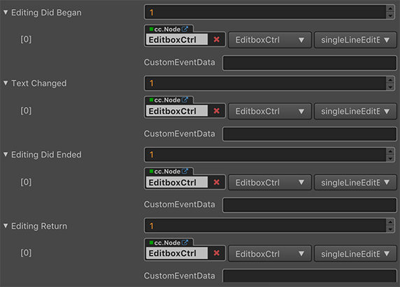
| Editing Did Began | The event handler to be called when EditBox began to edit text. Please refer to the Editing Did Began event below for details. |
| Text Changed | The event handler to be called when EditBox text changes. Please refer to the Text Changed event below for details. |
| Editing Did Ended | The event handler to be called when EditBox edit ends. Please refer to the Editing Did Ended event below for details. |
| Editing Return | The event handler to be called when return key is pressed, Currently does not support windows platform. Please refer to the Editing Return event below for details. |
EditBox Event

Editing Did Began Event
| Property | Function Explanation |
|---|---|
| Target | Node with the script component. |
| Component | Script component name. |
| Handler | Assign a callback function which will be triggered before user starting to input text. |
| customEventData | A user-defined string value passed as the last event argument of the event callback. |
Note: This event will be triggered when the user clicks on EditBox.
Text Changed Event
| Property | Function Explanation |
|---|---|
| Target | Node with the script component. |
| Component | Script component name. |
| Handler | Assign a callback function which will be triggered when user is editing text. |
| customEventData | A user-defined string value passed as the last event argument of the event callback. |
Note: This event will be triggered each time when the content in EditBox is changed.
Editing Did Ended Event
| Property | Function Explanation |
|---|---|
| Target | Node with the script component. |
| Component | Script component name. |
| Handler | Assign a callback function which will be triggered after user finished input text. |
| customEventData | A user-defined string value passed as the last event argument of the event callback. |
Note: This event will be triggered when the EditBox loses focus.
Usually when in single line input mode, it's triggered after user presses Return key or clicks the area outside of EditBox.
When in multiline input mode, it's triggered only after user click the area outside of EditBox.
Editing Return Event
| Property | Function Explanation |
|---|---|
| Target | Node with the script component. |
| Component | Script component name. |
| Handler | Assign a callback function which will be triggered when the user presses Return key. |
| customEventData | A user-defined string value passed as the last event argument of the event callback. |
Note: This event will be triggered when the user presses the Return key or presses the Done button on soft keyboard on the mobile.
In single line mode, EditBox may lose its focus if users press Return.
Detailed explanation
- Keyboard Return Type is mainly designed for mobile device input. You could use this option to customize Return key style of virtual keyboard.
- If you want to input password, you need set Input Flag to
PASSWORDand the Input Mode mustn't beANY, usually we use Single Line. - If you want to enable multiline input support, the flag of
Input Modeshould be set toAny. - The background image of EditBox support slice 9, you could customize the border as you did in Sprite component.
Add a callback through the script code
Method one
The event callback added by this method is the same as the event callback added by the editor, all added by code. First you need to construct a cc.Component.EventHandler object, and then set the corresponding target, component, handler and customEventData parameters.
var editboxEventHandler = new cc.Component.EventHandler();
editboxEventHandler.target = this.node; // This node is the node to which your event handler code component belongs
editboxEventHandler.component = "cc.MyComponent"
editboxEventHandler.handler = "onEditDidBegan";
editboxEventHandler.customEventData = "foobar";

editbox.editingDidBegan.push(editboxEventHandler);
// You can also register other callback functions in a similar way.
// editbox.editingDidEnded.push(editboxEventHandler);
// editbox.textChanged.push(editboxEventHandler);
// editbox.editingReturn.push(editboxEventHandler);


// here is your component file
cc.Class({
    name: 'cc.MyComponent'
    extends: cc.Component,

    properties: {
    },

    onEditDidBegan: function(editbox, customEventData) {
        // The editbox here is a cc.EditBox object.
        // The customEventData parameter here is equal to the "foobar" you set earlier.
    },
    // Suppose this callback is for the editingDidEnded event.
    onEditDidEnded: function(editbox, customEventData) {
        // The editbox here is a cc.EditBox object.
        // The customEventData parameter here is equal to the "foobar" you set earlier.
    }
    // Suppose this callback is for the textChanged event.
    onTextChanged: function(text, editbox, customEventData) {
        // The text here indicates the text content of the modified EditBox.
        // The editbox here is a cc.EditBox object.
        // The customEventData parameter here is equal to the "foobar" you set earlier.
    }
    // Suppose this callback is for the editingReturn event.
    onEditingReturn: function(editbox,  customEventData) {
        // The editbox here is a cc.EditBox object.
        // The customEventData parameter here is equal to the "foobar" you set earlier.
    }
});
Method two
Added by the way of editbox.node.on('editing-did-began', ...).
// Suppose we add an event handler callback inside a component's onLoad method and event handlers in the callback function:

cc.Class({
    extends: cc.Component,

    properties: {
       editbox: cc.EditBox
    },

    onLoad: function () {
       this.editbox.node.on('editing-did-began', this.callback, this);
    },

    callback: function (editbox) {
       // The parameter of the callback is the editbox component.
       // do whatever you want with the editbox.
    }
});
Similarly, you can register events such as editing-did-ended, text-changed, editing-return, etc. The parameters of the callback function for these events are consistent with the parameters of editing-did-began.