VideoPlayer Component Reference
VideoPlayer is a component for playing videos, you could use this component for playing local video and remote videos.
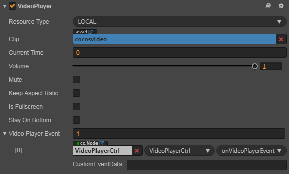
Play local video:

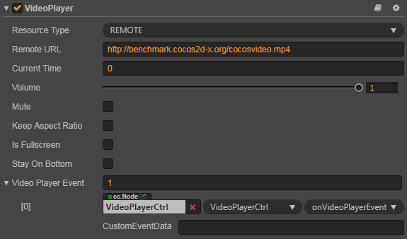
Play remote video:

Click Add Component at the bottom of Properties panel and select VideoPlayer from UI Component to add the VideoPlayer component to the node.
For more information about VideoPlayer's scripting interface, please refer to VideoPlayer API.
VideoPlayer Properties
| Property | Function Explanation |
|---|---|
| Resource Type | The resource type of videoplayer, REMOTE for remote url and LOCAL for local file path. |
| Clip | Displayed when Resource Type is LOCAL, feed it with a local video path. |
| Remote URL | Displayed when Resource Type is REMOTE, feed it with a remote video URL. |
| Current Time | The current time when video start to play. |
| Volume | The volume of the video. (0.0 ~ 1.0) |
| Mute | Mutes the VideoPlayer. Mute sets the volume=0, Un-Mute restore the original volume. |
| Keep Aspect Ratio | Whether keep the aspect ratio of the original video. |
| Is Fullscreen | Whether play video in fullscreen mode. |
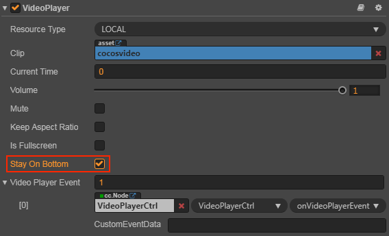
| Stay On Bottom | Display video below the game view (Only available on web). |
| Video Player Event | The video player's callback, it will be triggered when certain event occurs. Please refer to the VideoPlayer Event section below or VideoPlayerEvent API for more details. |
Note: in
cc.Nodeof the Video Player Event property, you should fill in a Node that hangs the user script component, and in the user script you can use the relevant VideoPlayer event according to the user's needs.
VideoPlayer Event
VideoPlayerEvent Event
| Properties | Function Explanation |
|---|---|
| target | Node with the script component. |
| component | Script component name. |
| handler | Specify a callback, when the video player is about to playing or paused, it will be called. There is a parameter in the callback which indicate the state of played videos. |
| customEventData | The user specifies that any string is passed in as the last parameter of the event callback |
For more information, please refer to Component.EventHandler Class.
Parameter of VideoPlayerEvent
| Name | Function Explanation |
|---|---|
| PLAYING | Video is playing. |
| PAUSED | Video is paused. |
| STOPPED | Video is stopped. |
| COMPLETED | Video is completed. |
| META_LOADED | Video's meta data is loaded. |
| CLICKED | Video is clicked by the user. |
| READY_TO_PLAY | Video is ready to play. |
Note: on iOS platform, due to the platform limitations, the CLICKED event can't be fired when VideoPlayer is in fullscreen mode. If you want to let the Video played in fullscreen and also fire the CLICKED event properly, you should use a Widget component to hack the VideoPlayer's size.
For more information, please refer to the VideoPlayer Events or 09_videoplayer of the example-cases samples bundled with Creator.
Detailed Explanation
The supported video types are determined by the supported OS, in order to make it works across all the supported platforms, we suggest to use mp4 format.
Add a callback via script
Method one
This method uses the same API that editor uses to add an event callback on Button component. You need to construct a cc.Component.EventHandler object first, and then set the corresponding target, component, handler and customEventData parameters.
var videoPlayerEventHandler = new cc.Component.EventHandler();
videoPlayerEventHandler.target = this.node; // This Node node is the one to which your event-handling code component belongs
videoPlayerEventHandler.component = "cc.MyComponent"
videoPlayerEventHandler.handler = "callback";
videoPlayerEventHandler.customEventData = "foobar";

videoPlayer.videoPlayerEvent.push(videoPlayerEventHandler);

// Here is your component file
cc.Class({
    name: 'cc.MyComponent'
    extends: cc.Component,

    properties: {
    },

    // The order of parameters should not change
    callback: function(videoplayer, eventType, customEventData) {
        // The "videoplayer" is a VideoPlayer component instance
        // The "eventType" is typed as cc.VideoPlayer.EventType
        // The "customEventData" is "foobar"
    }
});
Method two
Add event callback with videoplayer.node.on('ready-to-play', ...)
// Suppose we add event handling callbacks in the onLoad method of a component and perform event handling in the callback function:

cc.Class({
    extends: cc.Component,

    properties: {
       videoplayer: cc.VideoPlayer
    },

    onLoad: function () {
       this.videoplayer.node.on('ready-to-play', this.callback, this);
    },

    callback: function (event) {
       // The "event" is EventCustom, use "event.detail" to get VideoPlayer component
       var videoplayer = event.detail;
       // Do whatever you want with videoplayer
       // You can't pass "customEventData" in this way
    }
});
Likewise, you can also register meta-loaded, clicked, playing events, and the parameters of the callback function for these events are consistent with the read-to-play parameters.
About VideoPlayer events, please refer to VideoPlayer API for details.
How to display a UI upon a video
You can display a UI upon a video in three steps:
- Set
cc.macro.ENABLE_TRANSPARENT_CANVAS = true. - Make sure the alpha value of the camera's background color is 0.
Check the stayOnBottom property on the VideoPlayer in the Properties panel.

Notes:
- This feature is only supported on Web.
- The specific effects are not guaranteed to be consistent, depending on whether each browser supports or restricts.
- After the stayOnBottom is enabled, the
clickedevent inVideoPlayerEventcannot be listened normally.
For more information, please refer to the 09_videoplayer/videoPlayer-stayOnBotton of the example-cases samples bundled with Creator. Results as shown below:

Support platform
Because different platforms have different authorization, API and control methods for VideoPlayer component. And have not yet formed a unified standard, only Web, iOS, Android, WeChat Mini Games, Facebook Instant Games and Google Play Instant platforms are currently supported.