Layout Component Reference
Layout is a component for UI container nodes. This component provide to the container various layout functionalities to automatically arrange all the children, so that the developer can make list, page, grid container, etc conveniently.
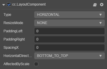
Horizontal Layout

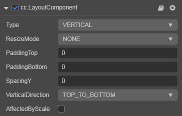
Vertical Layout

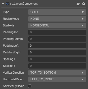
Grid Layout

Click the Add Component button at the bottom of the Inspector panel and select UI/Layout to add the Layout component to the node.
Layout Properties
| Properties | Function Explanation |
|---|---|
| Type | Layout type, including NONE, HORIZONTAL, VERTICAL and GRID. See Auto Layout for details. |
| ResizeMode | Resize mode, including NONE, CHILDREN and CONTAINER. |
| PaddingLeft | The left padding between the children and the container frame. |
| PaddingRight | The right padding between the children and the container frame. |
| PaddingTop | The top padding between the children and the container frame. |
| PaddingBottom | The bottom padding between the children and the container frame. |
| SpacingX | The spacing between children in the horizontal layout. NONE mode doesn't have this property. |
| SpacingY | The spacing between children in the vertical layout. NONE mode doesn't have this property. |
| HorizontalDirection | When it is designated as horizontal layout, this property determines which side(left or right) does the first child node start in the layout. When the Layout type is set to Grid, this property along with Start Axis property determine the starting horizontal alignment of Grid layout elements. |
| VerticalDirection | When it is designated as vertical layout, this property determines which side(top or bottom) does the first child node start in the layout. When the Layout type is set to Grid, this property with Start Axis property determines the starting vertical alignment of Grid layout elements. |
| CellSize | This property is only available in Grid layout, CHILDREN resize mode, determines the size of each child node. |
| StartAxis | This property is only available in Grid layout, determines the arrangement direction of children. |
| AffectedByScale | Whether the scale of the child node affects the layout. |
Detailed Explanation
The default layout type is NONE. It indicates that the container won't change size and position of the children. When the user places children manually, the container will take the minimum rectangular region that can contain all the children as its own size.
You can switch the layout container type by altering Type property in the Inspector panel, all the layout types support Resize Mode.
When Resize Mode is NONE, the size of the container and children is independent from each other.
When Resize Mode is CHILDREN, the size of the children will change with the size of the container to make sure all children fit inside the container's bounding box.
When Resize Mode is CONTAINER, the size of the container will change with the size of the children to make sure the container is large enough to contain all children inside its bounding box.
When using Grid layout, the Start Axis is very important.
When choosing HORIZONTAL, it will fill an entire row before a new row is started.
When choosing VERTICAL, it will fill an entire column before a new column is started.
Node: If the Layout's configuration is set in runtime, the results need to be updated until the next frame, unless you manually call
updateLayoutAPI.