
- 中文
- Cocos Creator
- Cocos2d-x
- AnySDK
-
Cocos Creator 1.9Version: 1.9
ScrollBar component reference
ScrollBar allows the user to scroll a picture (not currently supported in the public beta version) by dragging a sliding block. It's a bit similar to the Slider component, but it is mostly used for scrolling while Slider is used to set values.
Click the Add Component button at the bottom of the Properties panel and select ScrollBar from Add UI Component. You can then add the ScrollBar component to the node.
For the script interface of the ScrollBar, refer to ScrollBar API.
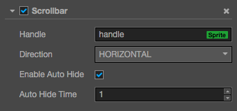
ScrollBar property
| Property | Function Explanation |
|---|---|
| Handle | ScrollBar foreground picture. Its length/width will be calculated according to the content size of ScrollView and the dimensions of the actual display area. |
| Direction | Scroll direction. You can currently select from either horizontal or vertical. |
| Enable Auto Hide | Enable or disable auto hide. If it is enabled, then Auto Hide Time will hide automatically after the ScrollBar is shown. |
| Auto Hide Time | Auto hide time; need to set Enable Auto Hide along with it. |
Detailed explanation
ScrollBar normally is used together with ScrollView instead of being used alone. Also, ScrollBar needs to assign a Sprite component, i.e. Handle in the attribute panel.
Normally we will also designate a background picture to ScrollBar. This can be used to indicate the length or width of the whole of the ScrollBar.