
- 中文
- Cocos Creator
- Cocos2d-x
- AnySDK
-
Cocos Creator 1.9Version: 1.9
Toggle component reference
The toggle component is a CheckBox, when it used together with a ToggleGroup, it could be treated as a RadioButton.
Click the Add component button at the bottom of the Properties panel and select Toggle from Add UI component. You can then add the Toggle component to the node.
The API reference of Toggle is here: Toggle API.
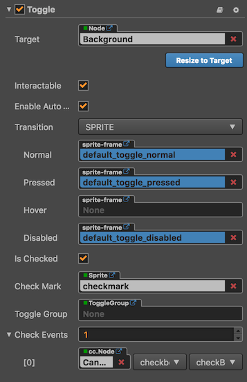
Toggle property
| Property | Function Explanation |
|---|---|
| isChecked | Boolean type. When this value is true, the check mark component will be enabled, otherwise the check mark component will be disabled. |
| checkMark | cc.Sprite type. The image used for the checkMark. |
| toggleGroup | cc.ToggleGroup type. The toggle group which the toggle belongs to, when it is null, the toggle is a CheckBox. Otherwise, the toggle is a RadioButton. |
| Check Events | Default list type is null. Each event added by the user is composed of the node reference, component name and a response function. Please check more detailed information in the chapter Button Event. |
Note: Because Toggle is inherited from Button, so the attributes exists in Button also apply to Toggle, please refer to the Button component manual for more information.
Toggle Event
| Properties | Function Explanation |
|---|---|
| Target | Node with the script component. |
| Component | Script component name. |
| Handler | Assign a callback function which will be triggered when the user clicks and releases the Toggle. |
| customEventData | A user-defined string value passed as the last event argument of the event callback. |
The Toggle event callback has two parameters, the first one is the Toggle itself and the second argument is the customEventData.
Detailed explanation
The generic node hierarchy of Toggle is as below:
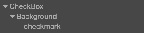
Note: the checkMark node could be put on top of the background node.