
- 中文
- Cocos Creator
- Cocos2d-x
- AnySDK
-
Cocos Creator 1.9Version: 1.9
Extends Inspector
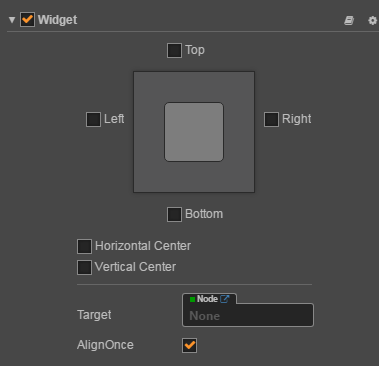
Inspector is a component control interface that is displayed in the Properties panel. Sometimes we need to define an Inspector for the Component we write, and display it in a custom way.For example, the special form of Widget component is designed through by the inspector extends
The steps are as follows:
- Include the custom Inspector entry file in the component
- Create an extension package for the custom Inspector
- Write the custom Inspector entry file in the extension package
Register Inspector entry
First we need to define a Component script, and for this script that use the custom Inspector, as follows:
cc.Class ({
  name: 'Foobar',
  extends: cc.Component,
  editor: {
    inspector: 'packages: //foobar/inspector.js',
  },
  properties: {
    foo: 'Foo',
    bar: 'Bar'
  },
});
Notes:
- Here we define a
editorfield and define theinspectorentry file in this field. Basis yourinspector.jseditor will generate the correspondence frame.- In
inspectorwe use thepackages://protocol to define the path to the entry file. In Cocos Creator thepackages://protocol plus the package name is mapped to extension package folder.
Create a custom Inspector extension package
Now we create an extension package in the normal workflow. You can follow the your first expansion package guide.
Let's say our extension package is called foobar.
Note that after creating the extension package, you need to restart Cocos Creator so that he can read the Inspector in extension package correctly (not required for other extension functions).
Write a custom Inspector entry file in the extension package
Next we can define inspector.js in the foobar package:
Vue.component ('foobar-inspector', {
  template: `
    <ui-prop v-prop = "target.foo"> </ ui-prop>
    <ui-prop v-prop = "target.bar"> </ ui-prop>
  `

  props: {
    target: {
      twoWay: true,
      type: Object,
    },
  },
});
Cocos Creator's Inspector extension uses vuejs for UI. Here we define a vue component. And set props in the component so that it contains target data to complete the entire Inspector data definition.
The target is an instance of our Foobar class in the Inspector.
About target
The target instance mentioned in the previous section is the target that has been processed by Inspector. Its internal contains the processing of the properties.
When using target, we can not simply think that target.foo on behalf of the value of foo. If you go on in Chrome DevTools and check target.foo you will
find that it's an object rather than a 'Foo' string that we defined at the beginning. The object contains attrs, type, value and other information. Where value is the value we want to get.
The purpose of doing so is to make Inspector better access to all aspects of data visualization information. For example, when you define the properties of cc.Class:
properties: {
    //There is a Default, Get or Set value need to be assigned.
    foo: {
        default: 'Foo',
        readonly: true
    }
}
This time in the Inspector we can see target.foo.value is 'Foo', and target.foo.attrs.readonly is true. This information helps to help you create various interface combinations.
About attribute binding
Because this information is very cumbersome, In Cocos Creator we created some expansion for Vue directives, including v-prop, v-value, v-readonly and v-disable.
When you still want to use Cocos Creator's default scheme to display the data segment, you can use v-prop with the <ui-prop> control to do the binding,
<ui-prop v-prop = "target.foo"> </ui-prop>
When you want to use the native control of <ui-xxx>, you can use v-value for data binding, such as:
<ui-input v-value = "target.foo.value"> </ui-input>
When you want to apply readonly or disable behavior to a control, use v-readonly and v-disable. Such as:
<ui-button v-readonly = "target.foo.attrs.readonly"> Foo </ui-button>
<ui-button v-disable = "target.bar.value"> Bar </ui-button>