Cocos Creator
UI Components
UI Components Panel
To facilitate the layout, many pre-defined UI components are provided within the editor.
- Find Developer -> UI Components in the main menu at the top of the editor to view them.
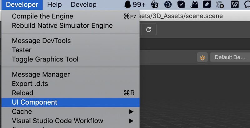
- Click it to open the following panel.
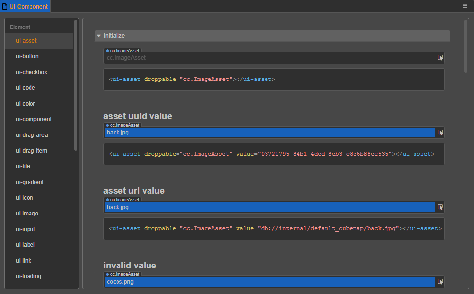
The panel consists of two parts, the left column lists the UI types currently supported by the engine, and the right column provides some examples that developers can use as needed.
Using in HTML
Using UI components in HTML is very easy, just copy the corresponding code into your HTML file and you are ready to use.
Using in Extension Panel
When extending the editor panel, it can be configured using json. In theory, all UI components with value attribute can be used to extend the editor panel, here are some common ones.
input-box
- Component:
ui-num-input - No additional properties
ui-slider
- Component:
ui-slider attributescomponent attributesminminimummaxmaximum valuestepstep length
ui-checkbox
- Component:
ui-checkbox - No additional properties
ui-select
- Component
ui-select itemslist elementvaluevaluelabeldisplay label
For usage examples, please refer to the documentation Extending the Preferences Panel and Extending Project Settings Panel.