Cocos Creator
Decorator
cc class
When applying a decorator ccclass to a class, such class is called a cc class. A cc class injects additional information to control Cocos Creator's serialization of the class object, the editor's presentation of the class object, etc. Therefore, component classes that do not have ccclass declared are incomplete, they cannot be added to nodes as components either.
The parameter name of the decorator ccclass specifies the name of the cc class, which is unique, even same ccclass name in scripts in different sub folder is forbidden and considered as conflicts. When the corresponding cc class needs to be retrieved, it can be found by its cc class name, e.g.:
Serialization. If the object is a
cc classobject, thecc classname of the object will be recorded during serialization, and the correspondingcc classwill be found for serialization based on this name during deserialization.When the
cc classis a component class,Nodecan look up the component by thecc classname of the component class.
ts
@ccclass('Example')
export class Example extends Component {
}
Component class decorators
These decorators are used to decorate sub classes of Component.
executeInEditMode
By default, all components are executed only at runtime, meaning that their lifecycle callbacks are never triggered in editor mode. executeInEditMode allows the current component to be executed in editor mode, the default value of this decorator is false.
ts
const { ccclass, executeInEditMode } = _decorator;

@ccclass('Example')
@executeInEditMode(true)
export class Example extends Component {
    update (dt: number) {
        // Will be executed in editor environment
    }
}
requireComponent
The requireComponent decorator is used to specify a dependent component for the current component, the default value is null. When a component is added to a node, the engine will automatically add the dependent component to the same node if the dependent component does not exist yet, preventing script errors. This behavior is also valid at runtime.
ts
const { ccclass, requireComponent } = _decorator;

@ccclass('Example')
@requireComponent(Sprite)
export class Example extends Component {
}
executionOrder
executionOrder is used to specify the execution priority of component lifecycle callbacks. The execution ordering is described as follows.
- For different components on the same node, those with smaller
executionOrderare executed first, and those with the sameexecutionOrderare executed in the order in which they are added. - For the same component on different nodes, the order of execution is determined by the node tree.
This ordering setting is only valid for onLoad, onEnable, start, update and lateUpdate, but not for onDisable and onDestroy.
ts
const { ccclass, executionOrder } = _decorator;

@ccclass('Example')
@executionOrder(3)
export class Example extends Component {
}
disallowMultiple
Only allow one component of the same type (with subclasses) to be added to the same node to prevent logic conflicts, the default value is false.
ts
const { ccclass, disallowMultiple } = _decorator;

@ccclass('Example')
@disallowMultiple(true)
export class Example extends Component {
}
menu
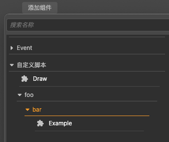
@menu(path) is used to add the current component to the component menu to make it easier for the user to find it.
Please note that this decorator generates a new menu in the drop-down box when the users click the Add Component button on the Inspector panel.
ts
const { ccclass, menu } = _decorator;

@ccclass('Example')
@menu('foo/bar')
export class Example extends Component {
}
help
Specify the URL of the current component's help page. Once set, a help icon will appear in the Inspector panel and can be clicked to open the specified page.
ts
const { ccclass, help } = _decorator;

@ccclass('Example')
@help('https://docs.cocos.com/creator/3.5/manual/en/scripting/decorator.html')
export class Example extends Component {
}
Property decorator
The decorator property is applied to a property or accessor of a cc class. Similar to the ccclass decorator, the property decorator injects additional information to control Cocos Creator's serialization of the property, the presentation of the property in the Inspector panel, and so on.
The various features of the property decorator are specified via its attributes in @property({}). Usage of all attributes can be found in: Property Attributes.
The following code is an example of the usage of the property decorator:
ts
@property({
    type: Node,
    visible: true,
})
targetNode: Node | null = null;
Next, some of the important property attributes are listed below.
type attribute
The type attribute specifies a type recognizable by the editor. The type can be specified with several forms of arguments.
Built-in primitive type:
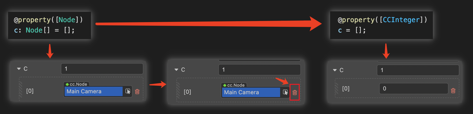
CCInteger,CCFloat,CCBoolean, andCCStringare built-in property type identifiers that generally work on array properties. Non-array types usually do not need to explicitly declare a type.CCIntegerdeclares the type as integer.CCFloatdeclares the type as floating point.CCStringdeclares the type as String.CCBooleandeclares the type as Boolean.
Other
cc classtypeAll properties with
cc classtype need to explicitly specify its type, otherwise the editor will not be able to recognize the type and how to serialization the property.Array type
When use the built-in primitive type or the
cc classtype as array element type for an array property, the property can be declared using the array type. For example,[CCInteger],[Node]will let the Inspector panel present the property as an array of integers and an array of nodes, respectively.
If the property does not specify a type, Cocos Creator will derive its cc type from the property's default value or the result of an initialization formula:
- If the type of the property is the JavaScript primitive types
number,string, andboolean, then the propertytypeisCCFloat,CCString, andCCBoolean, respectively. - Under other circumstances, the property's type will be undefined, and the editor will prompt a
Type(Unknown)notice in the Inspector panel.
Note: when using the JavaScript built-in constructors
Number,String,Booleanastype, there will be a warning and they will be treated asCCFloat,CCString,CCBooleanrespectively. Modifying the type of an initialized array property, a manual clear of the original array data is necessary, otherwise the data type will be inconsistent and lead to data mismatch.
Note: editable properties that need to be presented in the Inspector panel should not have
_at the beginning of the property name, otherwise they will be recognized as private properties, and private properties will not be displayed in the component Inspector panel.
The following code demonstrates the declaration of properties for different cc types.
ts
import { _decorator, CCInteger, Node, Enum } from 'cc';
const { ccclass, property, integer, float, type } = _decorator;

enum A {
    c,
    d
}
Enum(A);

@ccclass
class MyClass {
    @property // JavaScript primitive type, automatically recognized as Creator's floating-point type by default.
    index = 0;

    @property(Node) // Declare property cc to be of type Node, which is equivalent to @property({type: Node}) when the property parameter is only type.
    targetNode: Node | null = null; // Equivalent to targetNode: Node = null!

    // Declare the cc type of the property children to be a Node array
    @property({
        type: [Node]
    })
    children: Node[] = [];

    @property({
        type: String,
    }) // Warning: the constructor String should not be used. equivalent to CCString. or you can choose not to declare the type
    text = '';

    @property
    children2 = []; // Undeclared cc type, inferring from initialization result that the elements are undefined arrays

    @property
    _valueB = 'abc'; // Properties starting with '_' here are only serialized and will not be displayed in the editor properties panel

    @property({ type: A })
    accx : A = A.c;
}
For convenience, several additional decorators are provided to quickly declare cc types. If you only need to declare type attribute of the property, you can use the following decorators instead of @property:
| Decorators | Corresponding property writes |
|---|---|
| @type(t) | @property(t) |
| @integer | @property(CCInteger) |
| @float | @property(CCFloat) |
ts
import { _decorator, CCInteger, Node } from 'cc';
const { ccclass, property, integer, float, type } = _decorator;
@ccclass
class MyClass {
    @integer // declare the cc type of the property as an integer
    index = 0;

    @type([Node]) // Declare the cc type of the property children to be a Node number
        children: Node[] = [];

    @type(String) // Warning: should not use constructor String. equivalent to CCString. can also choose not to declare type
    text = '';
    // JavaScript primitive types `number`, `string`, `boolean` can usually be undeclared
    // You can just write
    @property
    text = '';
}
visible attribute
In general, whether an property is displayed in the Inspector panel depends on whether the property name starts with _. If it starts with _, it is not displayed.
To force display in the Inspector panel, set the visible attribute to true:
typescript
@property({ visible: true })
private _num = 0;
To force hiding, set the visible attribute to false:
typescript
@property({ visible: false })
num = 0;
dynamic visibility
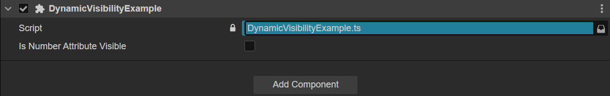
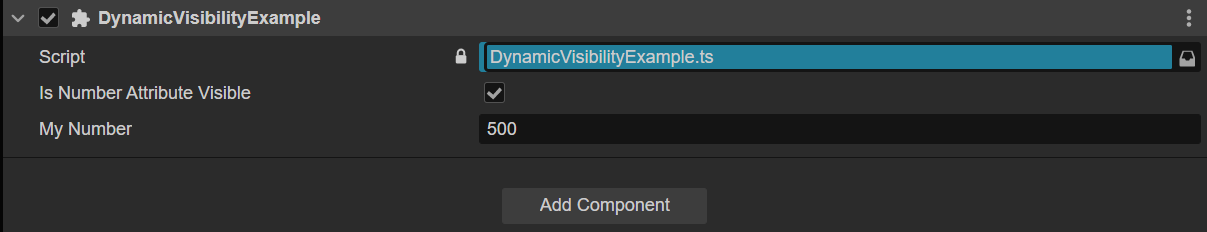
To set visibility dynamically, you must pass a function to it with the this argument and return a boolean:
typescript
@ccclass('DynamicVisibilityExample')
export class DynamicVisibilityExample extends Component
{
    @property(CCBoolean)
    private isNumberAttributeVisible: boolean = true;

    @property({visible(this: DynamicVisibilityExample){return this.isNumberAttributeVisible;}, type: CCInteger})
    private myNumber: number = 500;
}- When false
- When true
serializable attribute
Properties are serialized by default. Once serialized, the property values set in the editor will be saved to the scene and other resource files, and will be automatically restored to the set property values when the scene is loaded. To not serialize, set serializable as false.
typescript
@property({ serializable: false })
num = 0;
override attribute
All properties are inherited by subclasses. If a subclass wants to override a property of the same name of the parent class, the override attribute needs to be set explicitly, otherwise, there will be a renaming warning:
typescript
@property({ tooltip: "my id", override: true })
id = "";
group attribute
If there are many properties or mixed properties defined in the script, the properties can be grouped and sorted by group for easy management. It also supports sorting properties within a group.
@property({ group: { name } })@property({ group: { id, name, displayOrder, style } })
| Property | Description |
|---|---|
id | Group ID, string type, is a unique identifier for the property group, and defaults to default. |
name | The name to classify the properties in the group, string type. |
displayOrder | Sort the groups, number type. The smaller the number, the higher the sorting. The default is Infinity, which means the group is sorted last.If there are multiple groups without displayOrder set, they will be sorted in the order declared in the script. |
style | Grouping styles, currently tab and section styles are supported. The default value is tab. |
Example script is as follows:
ts
import { _decorator, Component, Label, Sprite } from 'cc';
const { ccclass, property } = _decorator;

@ccclass('SayHello')
export class SayHello extends Component {

    // Group 1
    // The property category named "bar" within the group, which contains a Label property named "label".
    @property({ group: { name: 'bar' }, type: Label })
    label: Label = null!;
    // The property category named "foo" within the group, which contains a Sprite property named "sprite".
    @property({ group: { name: 'foo' }, type: Sprite })
    sprite: Sprite = null!;

    // Group 2
    // The property category named "bar2" within the group, which contains a Label property named "label2" and a Sprite property named "sprite2".
    @property({ group: { name: 'bar2', id: '2', displayOrder: 1 }, type: Label })
    label2: Label = null!;
    @property({ group: { name: 'bar2', id: '2' }, type: Sprite })
    sprite2: Sprite = null!;

}
Mounting the script to the node displays the following image in the Inspector panel:
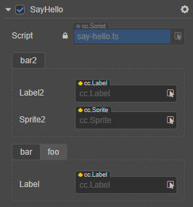
Because group 1 does not specify displayOrder and group 2 specifies displayOrder as 1, group 2 will be ranked ahead of group 1.
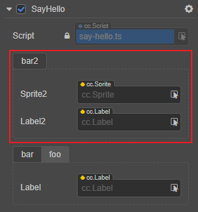
Sorting the properties within a group can also be done via displayOrder. Taking group 2 as an example, it is currently sorted in the order defined in the script, with label2 in front of sprite2. Let's adjust it to:
ts
// Group 2
@property({ group: { name: 'bar2', id: '2', displayOrder: 1 }, displayOrder: 2, type: Label })
label2: Label = null!;
@property({ group: { name: 'bar2', id: '2' }, displayOrder: 1, type: Sprite })
sprite2: Sprite = null!;
Back to the editor, the sprite2 is now in front of label2 in the Inspector panel:
For additional information about the properties, please refer to the Properties documentation.
Built-in Type User Interface
For some common types, the engine supports a default user interface that can be use via the developers' needs.
Color
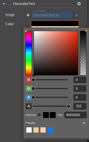
The code example is as follows:
ts@property(Color) color:ColorCurve: Used to save the type of curve, sample, and sample data, and the result can be evaluated.
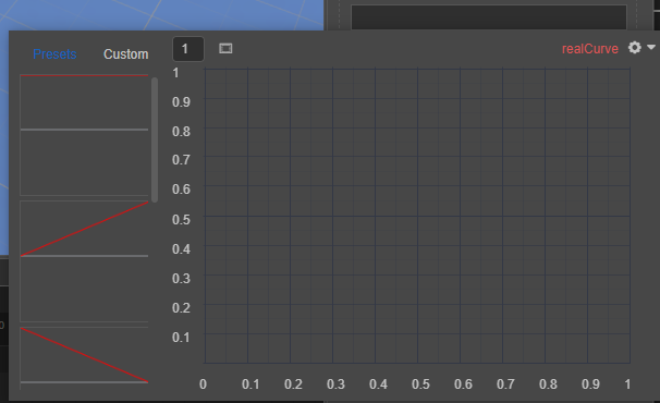
The code example is as follows:
ts@property(RealCurve) realCurve:RealCurve = new RealCurve();CurveRange: Use constants, curves, two-curves, or two-constants to control the curve-range
The code example is as follows:
ts@property(CurveRange) curveRang : CurveRange = new CurveRange();Gradient: You can record the key values of the gradient and evaluate the gradient result
The code example is as follows:
ts@property(Gradient) gradient = new Gradient();GradientRange: use color, gradient, two gradients, two colors or random color to evaluate the final color
The code example is as follows:
ts@property(GradientRange) gradientRange:GradientRange = new GradientRange();