Cocos Creator
ScrollBar Component Reference
The ScrollBar allows the user to scroll by dragging a sliding block. It's a bit similar to the Slider component, but it is mostly used as a part of the ScrollView while Slider is used independently to set values.
Click the Add Component button at the bottom of the Inspector panel and select UI/ScrollBar to add the ScrollBar component to the node.
Please refer to the ScrollBar API.
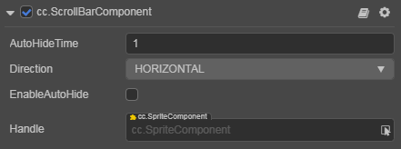
ScrollBar Properties
| Property | Function Explanation |
|---|---|
| AutoHideTime | Time to hide the ScrollBar automatically, need to set Enable Auto Hide to true for it to take effect |
| Direction | Scroll direction, including HORIZONTAL and VERTICAL |
| EnableAutoHide | Enable or disable auto hide. If this property is enabled, the ScrollBar will automatically disappear after actions stopped for AutoHideTime. |
| Handle | ScrollBar foreground picture. The length/width will be calculated according to the content size of ScrollView and the dimensions of the actual display area |
Detailed Explanation
The ScrollBar normally is used together with ScrollView instead of being used alone. Also, ScrollBar needs to assign a Sprite component, i.e. Handle in the Inspector panel.
Normally we will also designate a background image to ScrollBar. This can be used to indicate the length or width of the whole ScrollBar.