Extending the Preferences Panel
Preferences Panel Introduction
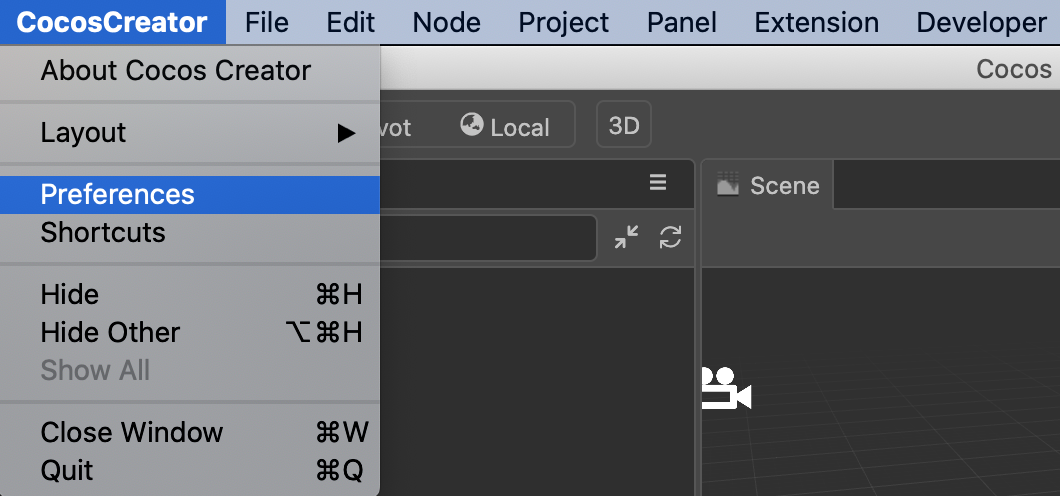
The Cocos Creator -> Preferences menu can be found in the top menu bar, as shown in the following image:

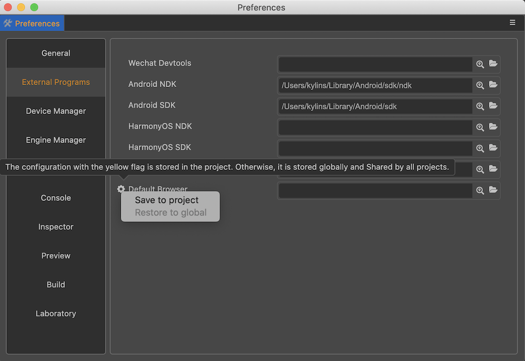
Clicking on it opens the Preferences panel, as shown below.

The Preferences panel is divided into left and right sides.
- The left side shows the names of the feature extensions that provide configuration items.
- On the right side is the operation panel rendered according to the configuration.
Changes on the panel are immediately modified to the corresponding configuration items. For more information about the Preferences panel, please refer to the document Preferences.
Customization panel
Cocos Creator allows each extension to register its own editor configuration, which is then displayed within the Preferences panel.
The preferences control editor-related configurations and will act on all projects. If you want to add only project-specific configurations, please refer to the documentation Custom Project Settings Panel.
Two ways of preference setting
Preference settings allow to display the configuration in two ways.
- general configuration
- Lab configuration
Generic settings are displayed directly as tabs, while lab switches are displayed centrally in a separate tab.
- When the functionality provided by the plug-in is more stable it is recommended to place the configuration data within the generic functionality.
- When the functions provided by the plug-in are in the development stage it is recommended that the switch configuration data of the function be placed in the lab configuration.
Preferences definition
Extending preferences depend on data configuration and need to be defined in contributions.profile.editor first.
Note: The configuration data in the preferences should be stored in the
profile.editorfield.
Once the data fields are defined, you also need to define the data to be displayed and the UI components to be used to display it in the contributions.preferences field. This is shown below.
{
    //`package.json`
    "name": "first-panel",
    "contributions": {
        "profile": {
            "editor": {
                "foo": {
                    "default": 1,
                    "label":"foo"
                },
                "foo1": {
                    "default": 1,
                    "label":"foo1"
                },
                "foo2": {
                    "default": false,
                    "label":"foo2"
                },
                "foo3": {
                    "default": 0,
                    "label":"foo3"
                }
            }
        },
        "preferences": {
            "properties": {
                "foo1": {
                    "ui": "ui-slider",
                    "attributes": {
                        "min": 0,
                        "max": 1,
                        "step": 0.1
                    }
                },
                "foo2": {
                    "ui": "ui-checkbox"
                },
                "foo3": {
                    "ui": "ui-select",
                    "items": [
                        {
                            "value": 0,
                            "label": "ITEM 0"
                        },
                        {
                            "value": 1,
                            "label": "ITEM 1"
                        },
                        {
                            "value": 2,
                            "label": "ITEM 2"
                        }
                    ]
                }
            },
            "laboratory": ["foo"]
        }
    }
}
In the above example, 4 data items are defined in the contributions.profile.project field: foo, foo1, foo2, foo3.
For more information on how to define profile related configuration, please refer to Configuration System.
In the contributions.preferences field, we define properties and laboratory.
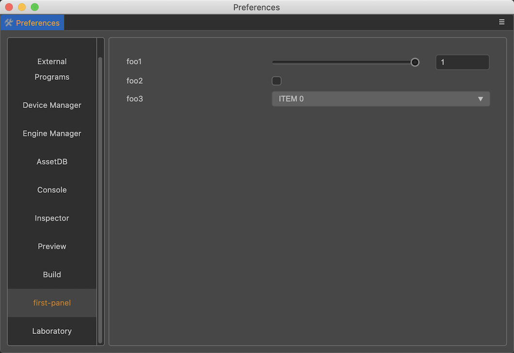
General configuration (properties)
The fields defined in properties will be displayed independently in a new tab with the same name as the extension in the preferences panel, as follows:

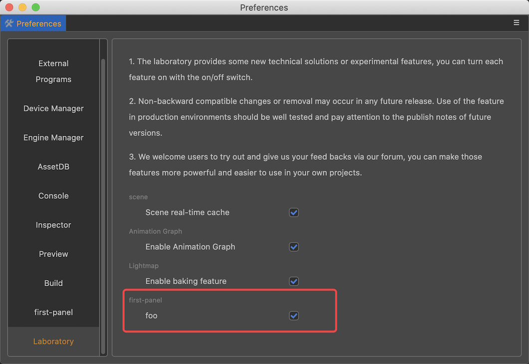
Laboratory configuration (laboratory)
The fields defined in laboratory will be displayed in the Laboratory tab in the preferences panel, as follows:

UI Component Configuration
This example shows the usage of 4 common UI components in customizing the preferences panel, in theory all UI components with value attribute can be used in the preferences panel, please refer to the document UI Components.