Cocos Creator
Write panel interface
The panel interface of Cocos Creator is written in HTML5 standard. HTML templates and CSS styles can be spedcified for the interface, and then write logic and interaction code for binding messages to interface elements. Developers without front-end programming experience don't have to worry too much. Through the learning in this section, developers will be able to master the writing skills of the Creator panel interface in a short time.
Customize your template
Usually before starting to write the interface, we always want to be able to see something in the interface. Something can be drawn on the panel interface through the template and style options of the panel definition function.
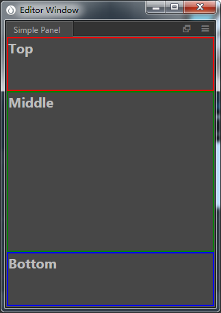
Generally, draw some blocks to plan the interface layout. Example:
javascript
Editor.Panel.extend({
  style: `
    .wrapper {
      box-sizing: border-box;
      border: 2px solid white;
      font-size: 20px;
      font-weight: bold;
    }

    .top {
      height: 20%;
      border-color: red;
    }

    .middle {
      height: 60%;
      border-color: green;
    }

    .bottom {
      height: 20%;
      border-color: blue;
    }
  `,

  template: `
    <div class="wrapper top">
      Top
    </div>

    <div class="wrapper middle">
      Middle
    </div>

    <div class="wrapper bottom">
      Bottom
    </div>
  `,
});
Using the above code, the interface looks as follows:
Interface layout
The interface layout is done by writing CSS in style. In the above example, a simple layout of the interface was demonstrated. To become more familiar with CSS, please review the W3 School's CSS Tutorial.
In the process of interface layout, sometimes it is necessary to better express the layout relationship between elements. For example, the height of Top and Bottom elements may be fixed at 30px, while the height of Middle element fills up the remaining space. Use CSS Flex layout to make it.
Try modifying the style part, as shown in this example:
javascript
Editor.Panel.extend({
  style: `
    :host {
      display: flex;
      flex-direction: column;
    }

    .wrapper {
      box-sizing: border-box;
      border: 2px solid white;
      font-size: 20px;
      font-weight: bold;
    }

    .top {
      height: 30px;
      border-color: red;
    }

    .middle {
      flex: 1;
      border-color: green;
    }

    .bottom {
      height: 30px;
      border-color: blue;
    }
  `
});
As the CSS Flex layout syntax is a bit complicated, Cocos Creator has repackaged this part for your convenience. For a detailed introduction to this part, please read the Interface Typesetting documentation.
Add UI elements
After planning the layout, consider adding interface elements to complete the interface functions. Usually, developers who are familiar with front-end programming will think of some common interface elements, such as <button>, <input>, and so on. These elements can of course be used directly, but it is strongly recommend to use Cocos Creator's built-in UI Kit elements. These built-in elements all start with ui-, such as <ui-button>, <ui-input>.
Cocos Creator provides a very rich set of built-in elements. Developers can get a more detailed understanding through reviewing the Mastering UI Kit documentation. The built-in elements have not only been carefully adjusted in style, but also unified message sending rules and can better handle system events such as focus.
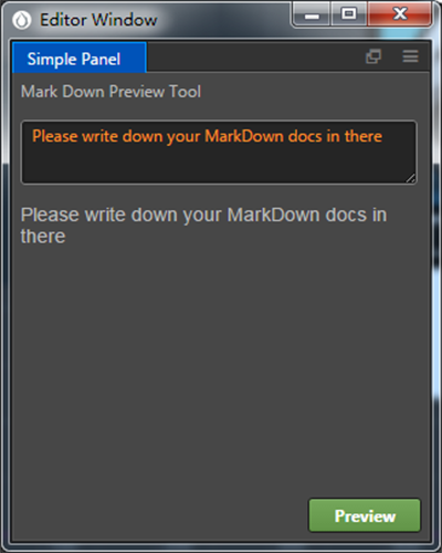
Let's enrich our panel above a bit:
javascript
Editor.Panel.extend({
  style: `
    :host {
      display: flex;
      flex-direction: column;
      margin: 5px;
    }

    .top {
      height: 30px;
    }

    .middle {
      flex: 1;
      overflow: auto;
    }

    .bottom {
      height: 30px;
    }
  `,

  template: `
    <div class="top">
      Mark Down 预览工具
    </div>

    <div class="middle layout vertical">
      <ui-text-area resize-v value="请编写你的 Markdown 文档"></ui-text-area>
      <ui-markdown class="flex-1"></ui-markdown>
    </div>

    <div class="bottom layout horizontal end-justified">
      <ui-button class="green">预览</ui-button>
    </div>
  `,
});
If everything is normal, the interface should look something like this example:
Add logical interaction to UI elements
Finally, complete the logic part of the panel through standard event handling code. Suppose one of the requirements needed is to render the Markdown document entered in the text-area and display it below each time we click the preview button. Consider the following code:
javascript
Editor.Panel.extend({
  // ...

  $: {
    txt: 'ui-text-area',
    mkd: 'ui-markdown',
    btn: 'ui-button',
  },

  ready () {
    this.$btn.addEventListener('confirm', () => {
      this.$mkd.value = this.$txt.value;
    });

    // init
    this.$mkd.value = this.$txt.value;
  },
});
Here the $ selector is used to pre-index the ui elements that are needed. Next, use the HTML standard API addEventListener to add events to the element. For the built-in UI Kit elements, each UI element has a set of standard events, namely: cancel, change and confirm. At the same time, most UI elements carry the value attribute, which records related value information within the element.
The code in this section is meant to show examples and provide inspiration to develop custom panel interfaces. To use the panel interface flexibly, learning and mastering the HTML5 standard in depth is required.